Design mixology: How to tastefully combine color and pattern
We may sound like a broken record but 2024 is truly the year of color and pattern, and we are here to help you embrace both of these design elements in a cohesive way. Let’s lay a few ground rules first to help you get started, then we’ll show you how to mix and match.
Rules for pattern & color
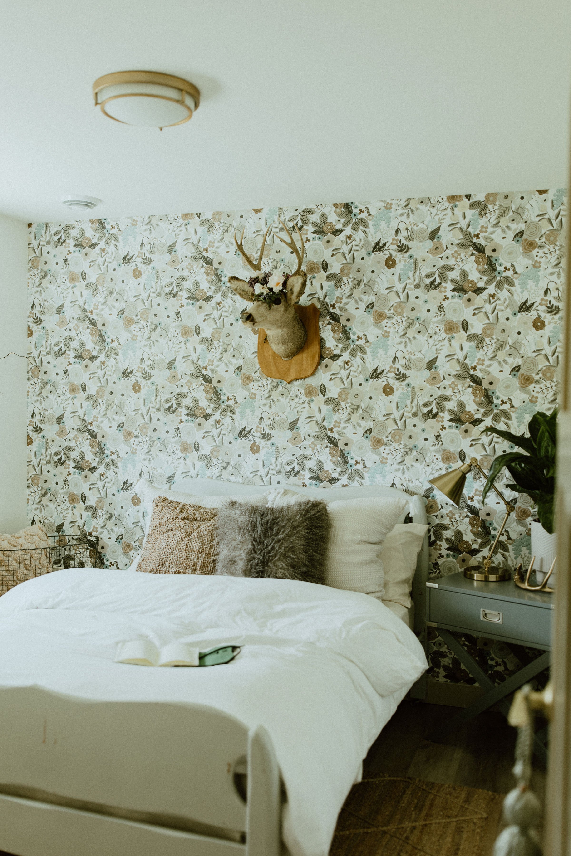
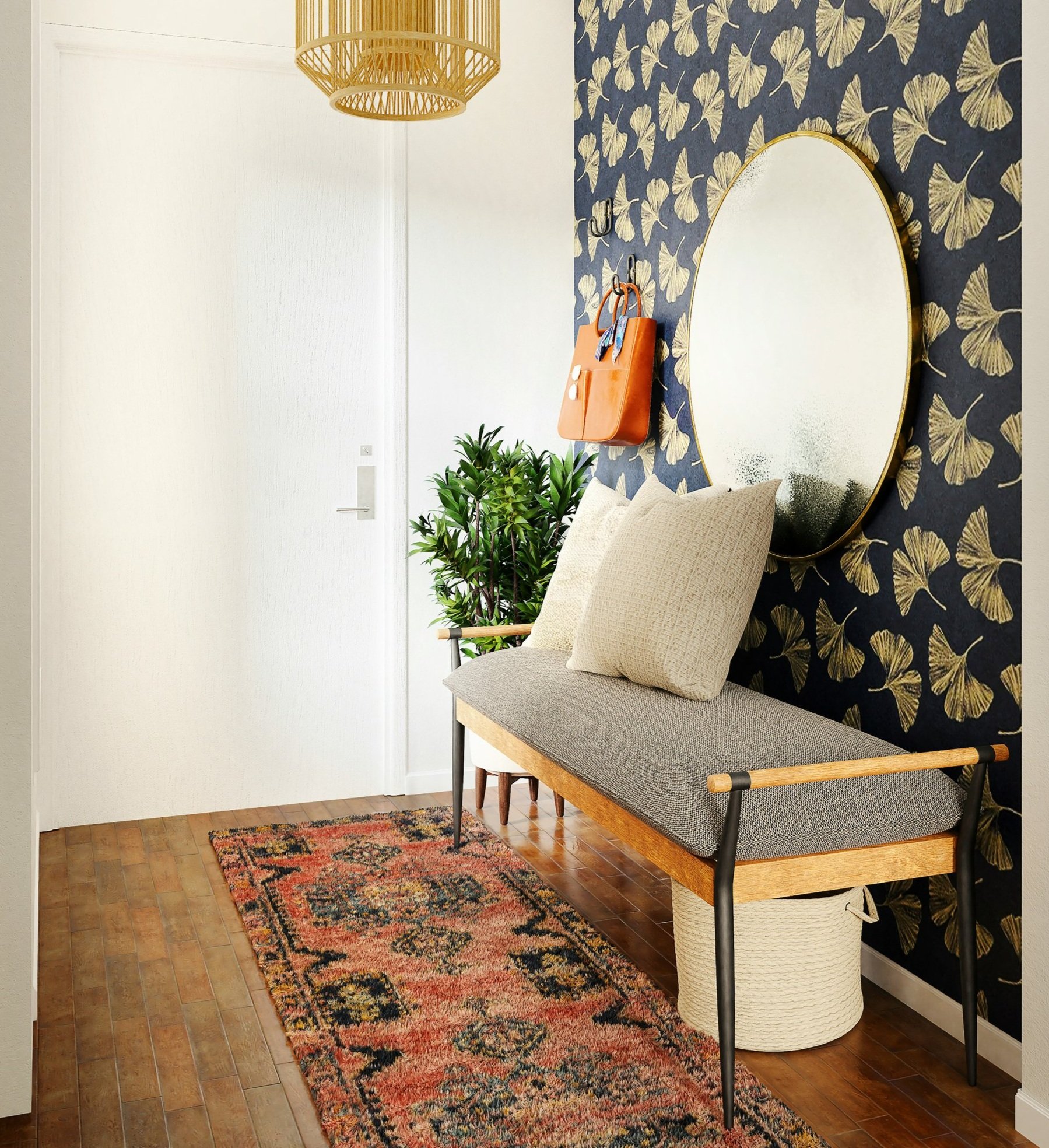
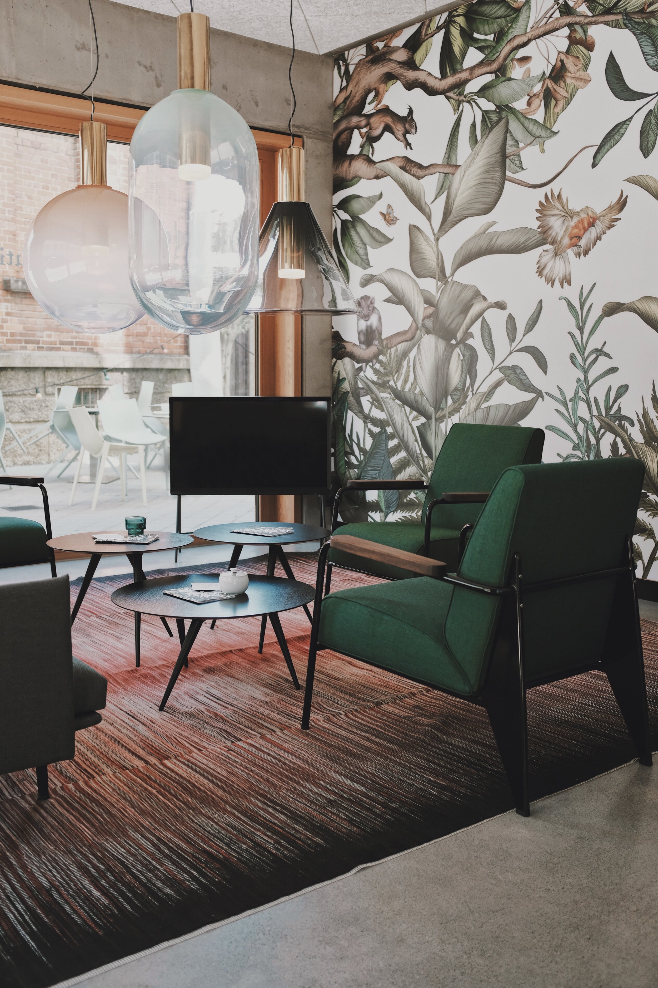
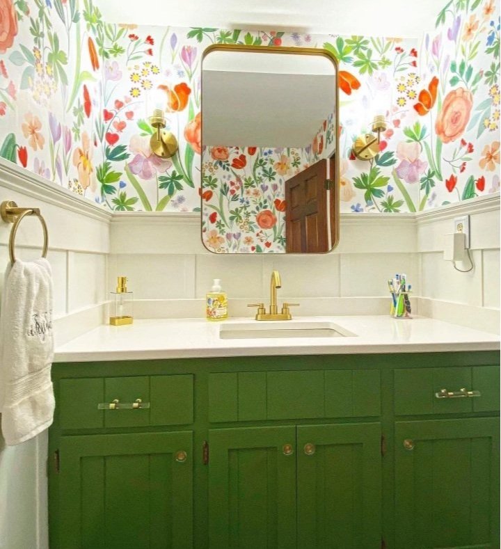
1. Identify the pattern scale – Mixing pattern scales requires balance. If you’re incorporating pattern into your curtains, throw pillows, and/or furniture, they shouldn’t compete with one another. A large-scale pattern on a curtain can be accented by a smaller pattern on the sofa or side chair. While we encourage mixing patterns in this way, don’t get ahead and add too many. Three is the maximum we would recommend.
There’s more out there than just complementary colors. You may find you enjoy other mixes more!
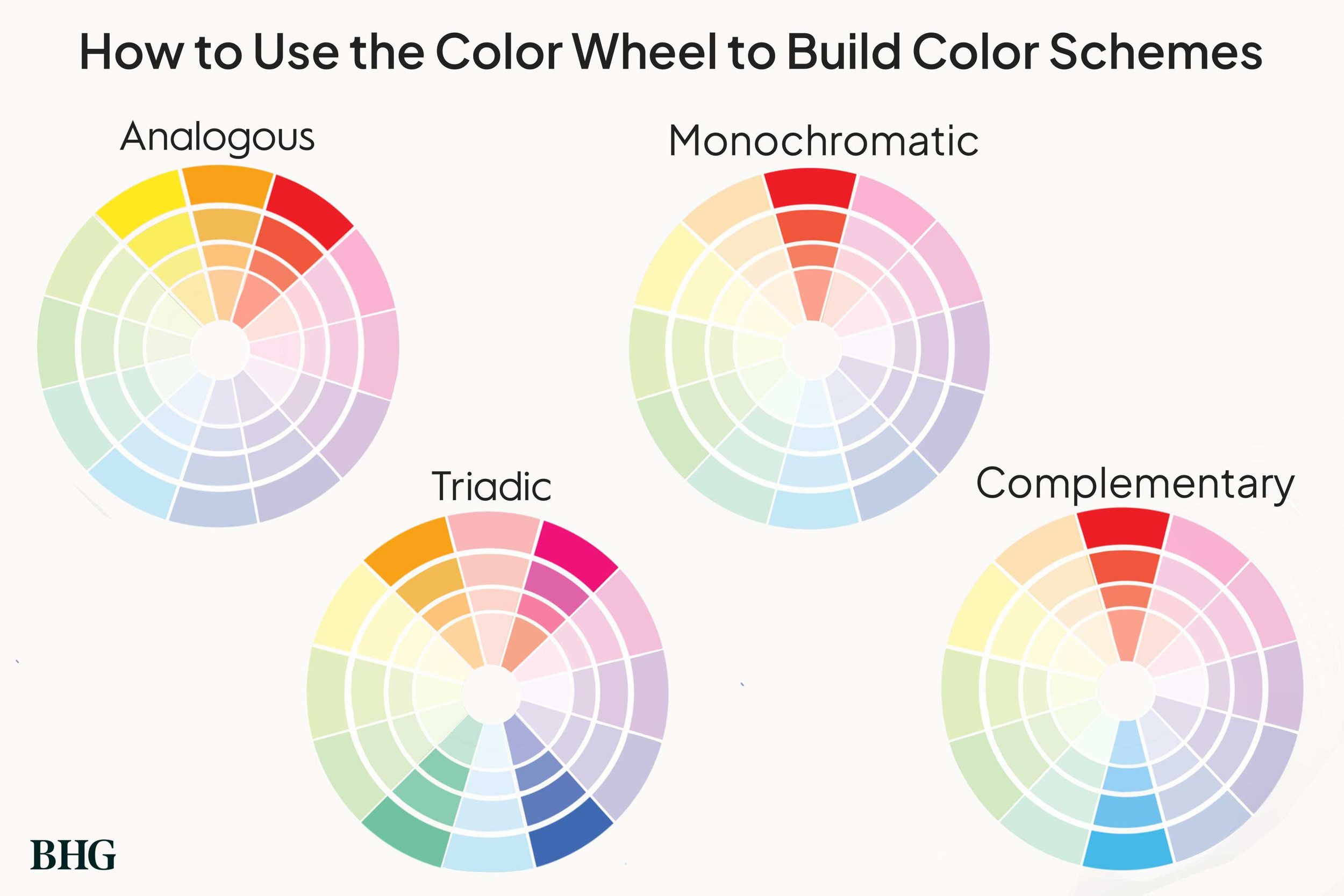
2. Understand the color wheel – If you’re going DIY with your decorating, you must understand the color wheel. (Or you can just hire us!) You probably already know most complimentary colors: Orange and blue, purple and yellow, red and green. But there is so much more to color mixing than just complimentary. Monochrome, analogous, triadic, split complementary – These schemes appear in our everyday life.
3. Pay attention to hue, tint, tone, and shade – Yes these are all different elements of color! The Hue is the pure color; the tint is what happens when you add white to the hue; the tone is a mix of white and black; and the shade is the hue plus black. Understanding how all of these play together can help you mix pattern and color. Perhaps your wall paint is the shade of your color, while your pattern plays off the tint of the hue. The next layer to this is in the undertones – whether the colors are warm or cool. When you put them side-by-side, you can really tell the difference.
How to use pattern & color
1. Choose a base – Start with a base pattern and color and build out from there. Use the rules for color above to determine your scheme. For the base, neutral patterns like stripes or small repeats work best.
2. Build out – Once your base color and pattern are in place, you can build out from there. Use the rules for pattern scales above when considering adding another pattern into the mix. Additional colors should be chosen carefully, considering the undertones as well as the general shade. If your wall base is a warm white, you don’t want to add a cool blue/bright white pattern. Likewise, if you’re into cool blues, you’ll really want to watch any complimentary orange for being too warm. Yes, there is such a thing as a cool orange!
3. Add texture – Texture creates depth to the design and prevents the room from falling flat despite the level of color. Mix glossy with velvet, or smooth with woven to add that level of interest.
4. Add wood – In any room, wood grounds and balances everything that is going on. But once again, you need to watch for warm or cool undertones. With the penchant for farmhouse furniture, there are lots of cool-tone grey woods out there. You’ll find the warmer woods in more traditional looks. If you stick to the rules you’ve set for your room, you shouldn’t have any problems.
We hope you make 2024 the year you embrace color and pattern. We’re here to help! Contact us for a consultation.